Both Agile development and User Experience (UX) design methodologies have been popular in software design and project management spheres as of late, and despite their popularity, there has been little effort to integrate them. Each approaches development from different perspectives—Agile is more focused on coding and project management, while UX is concerned with the usability of the product and actual user interface. Of course, these are two sides of the same coin. A software solution is unusable without some form of user interface, and a user interface is but an empty shell without a quality software product behind it.
Ferreira, Sharp, & Robinson (2011) suggest a framework for Agile and UX integration, founded on five principles:
- The user should be involved in the development process;
- Designers and developers must be willing to communicate and work together extremely closely;
- Designers must be willing to feed the developer with prototypes and user feedback;
- UCD practitioners must be given ample time in order to discover the basic users’ needs before any code; and,
- Agile/UCD integration must exist within a cohesive project management framework.
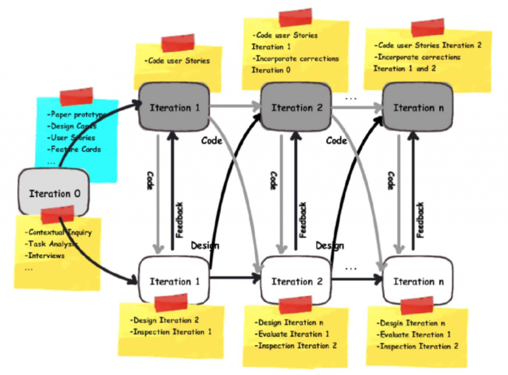
The framework itself has both the typical software developers and UX designers running in parallel iterations, giving and receiving feedback in each iteration, and the UX team working one Sprint ahead of the development team. Both start with a Sprint 0 to obtain context and task analysis for the project ahead. This ultimately generates User Stories, which are then distributed across the Sprints. These Stories first go through the UX team before being delivered to the development team, so that the UX designers can begin with the User Stories and intended outcomes to produce the interface. The authors observed both design and development teams in action, and noted many areas for integration and improvement. Most notably, the authors found that UX designers had no User Stories specific to them and found it difficult to design one sprint ahead. Usually, they were either on the same Sprint as the developers or one behind.
The authors present a solid argument for integrating Agile and UX methodologies, and since the article publication in 2011, the idea has caught on (e.g., Gothelf 2018). A variety of Agile- and UX- flavored methods are out there in the DevOps world at any moment and have dedicated followers and applications.
References
Ferreira, J., Sharp, H., & Robinson, H. (2011). User experience design and agile development: managing cooperation through articulation work. Software: Practice and Experience, 41(9), 963-974. doi:10.1002/spe.1012
Gothelf, J. (2018). Here is how UX design integrates with Agile and Scrum. Retrieved from https://medium.com/swlh/here-is-how-ux-design-integrates-with-agile-and-scrum-4f3cf8c10e24
